Adjust a Graph Value Axis Range
Each plotted metric has its own value axis at the side of the plot. Adjusting an axis changes the vertical scale of the curves drawn against it, which lets you magnify a metric whose variation is small compared with its axis, or pull a curve back inside the frame when it clips.
The adjusted range is kept with the study, so it is restored the next time you open that study.
Adjust a Value Axis Range
To change an axis's scale:
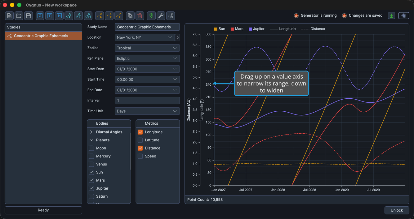
- Press and hold on a value axis at the side of the plot and drag up to narrow or down to widen its range.
The range expands or contracts symmetrically about the axis center, snapping to sensible steps, and the curves drawn against that axis rescale with it. The pointer changes to a vertical resize cursor when it is over an axis band, which is how you know the drag will adjust the axis rather than pan the plot.
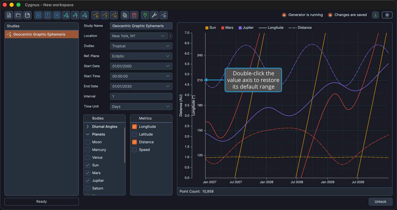
Restore a Value Axis to Its Default Range
To undo an adjustment and return the metric to the range the data implies:
- Double-click the value axis.
The axis drops its stored override and returns to its default range, and the curves drawn against it rescale accordingly.