Ephemeris Graph
See the shape of your generated data over time at a glance: turning points, cycles and convergences. Graphic Ephemeris and Graphic Aspect Ephemeris studies show an interactive time-series graph in place of an ephemeris table. Generate the study and read the curves, then check or uncheck metrics to change what is plotted.
Parts of the Graph
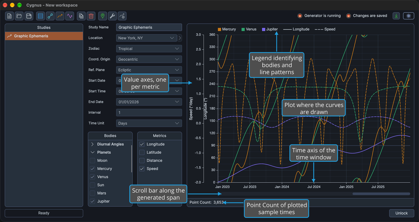
The graph fills the results area of a generated Graphic Ephemeris or Graphic Aspect Ephemeris study. Time is measured along the bottom, and each plotted metric has its own scale.
| Part | Description |
|---|---|
| Plot | The area where the curves are drawn. |
| Time axis | Lies along the foot of the plot and shows the stretch of time the graph covers, its time window. |
| Scroll bar | A horizontal bar beneath the time axis, for scrolling the time window along the generated span. |
| Value axes | One for each plotted metric, beside the plot. |
| Legend | Identifies the lines. It does not respond to clicks or other input. |
When you open the study, the graph shows the latest part of the generated span. To move to other dates, see Pan and Zoom the Graph Time Window.
Beneath the graph, the Point Count: bar shows how many sample times are plotted, as described in Record and Point Count.
Read the Curves
On a Graphic Ephemeris study, each selected body is drawn in the color set for it in Graph Settings, and the line pattern identifies the metric:
| Metric | Line Pattern |
|---|---|
| Longitude or Right Asc | Solid |
| Latitude or Declination | Dotted |
| Distance | Dash-dot |
| Speed | Dashed |
The metrics are labeled Right Asc and Declination instead of Longitude and Latitude when the study's reference plane is Equatorial. Distance is measured in AU and Speed in degrees per day.
On a Graphic Aspect Ephemeris study, each body pair is drawn in the color of its inner body, and the line pattern identifies the metric:
| Metric | Line Pattern |
|---|---|
| Cycle Angle | Solid |
| Separation | Dashed |
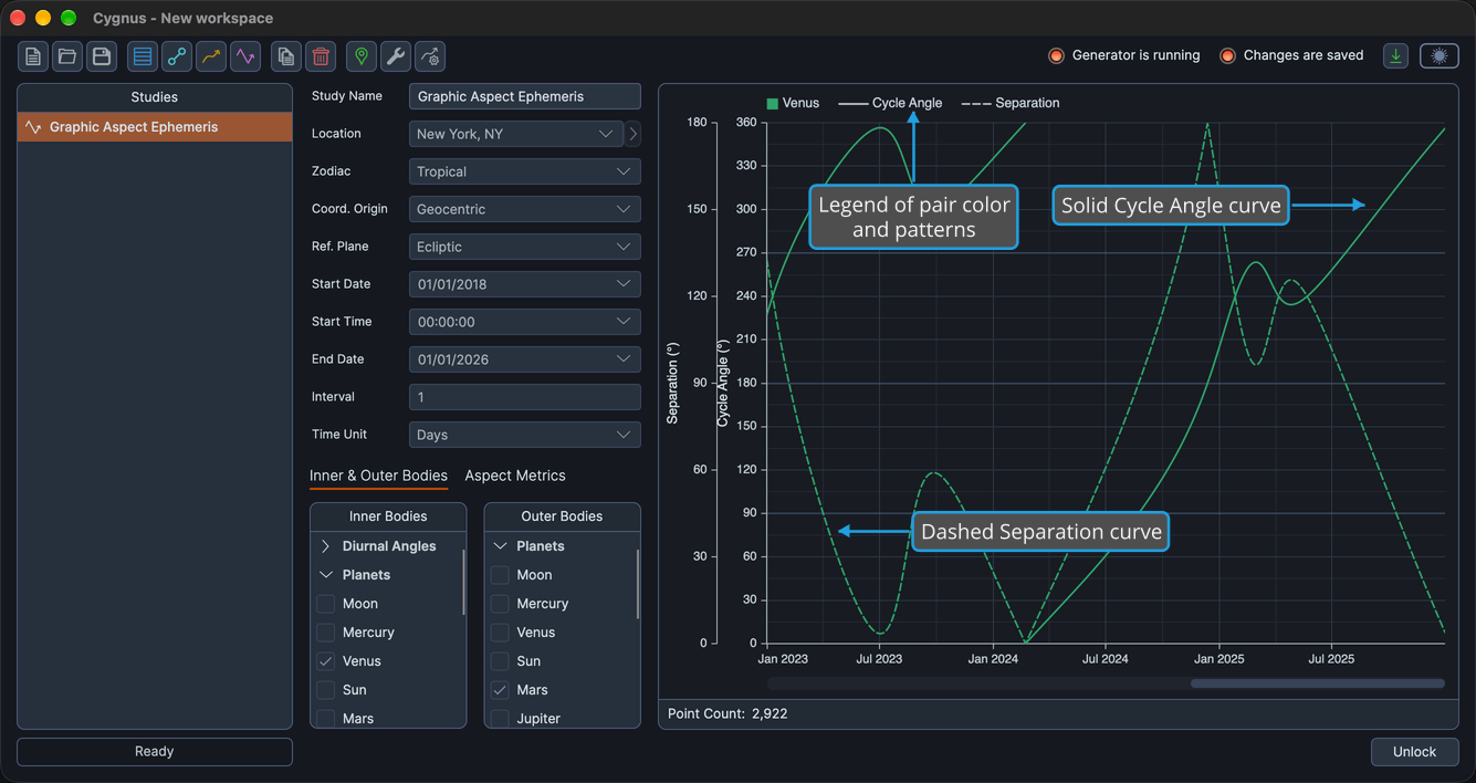
To read the exact date and value of a point instead of estimating them from the axes, rest the pointer on a curve, as described in Graph Hover Readout.
Choose What Is Plotted
The metrics you select decide which curves the graph draws:
- On a Graphic Ephemeris study, check or uncheck metrics in the Metrics list, as described in Body Metrics List. A new study plots Longitude only.
- On a Graphic Aspect Ephemeris study, check or uncheck metrics on the Aspect Metrics tab, as described in Aspect Metrics List. A new study plots Separation only.
Checking or unchecking a metric redraws the graph straight away, without generating the study again.
The plotted bodies are fixed once the study is generated. To plot different bodies, unlock the study, change the bodies selected and generate the study again. See Unlock Study, Bodies List and Generate Study.
Explore the Graph
The graph responds to the pointer in several ways, each described on its own page:
- Graph Hover Readout: rest the pointer on a curve to read the date and value of a point.
- Pan and Zoom the Graph Time Window: drag inside the plot to move through time, drag the time-axis strip or roll the mouse wheel to zoom, and use the scroll bar to scroll.
- Adjust a Graph Value Axis Range: drag a value axis to widen or narrow the range of the metric it scales.
- Open a Graph Point's Chart in Compass: double-click a point on a curve to open the chart for its date and time in the companion application Compass.
Related Topics
- Graphic Ephemeris Study: plot the positions of the selected bodies over time.
- Graphic Aspect Ephemeris Study: plot the cycle angle and separation of body pairs over time.
- Graph Settings: choose the line color for each body.
- Record and Point Count: confirm how many points a generation plotted.